For artwork, placement offers and graphic design, contact me on paul.bateman93@sky.com. Portfolio - http://www.behance.net/paulbateman93882e
Sunday 9 December 2012
Wednesday 5 December 2012
'Killer shot' visual
Using my 3dsmax model, printing, drawing, scanning and photoshopping several times, i've finally produced my 'killer shot' visual. Ceiling made from tent material with videos projected onto the back. Hanging boxes with screens inside expressing each sport/event with and atmosphere to represent this. stylized foam steps to represent graphics and branding typical of the theme. A caving experience with head height, confined videos of caving. Mirrors that create an endless desert scenario. Graph display for free tickets to the event that got you the most scared/excited (measured by heart-rate wristbands) and finally stylised logos for each event that represent the brand.
Labels:
drawing,
material,
model,
people,
perspective,
photoshop,
product,
project,
retail,
technology,
visual
Sunday 25 November 2012
Saturday 24 November 2012
New ground floor visual
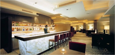
Ground floor visual - the new 'interactive experience' retail environment for SHAFF (Sheffield Adventure Film Festival) The space will be based in the packhorse centre, Huddersfield.
Films from past events showing extreme sports and adventure will be projected onto hung tvs, a couple of the tvs will also show different films giving a contemporary montage and layered effect.
Glass boxes under the floor give people the chance to see the actual filming and expedition equipment used in the making of those films adding a sense of reality to this digital space.
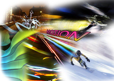
MOTION still being the drive of the design is hinted at in the forms of the 'peep holes' and also the flowing colour that gradually sweeps behind the perforated screen on the ceiling.
Box Park Nike
http://thenextweb.com/uk/2012/03/09/the-worlds-first-nike-fuelstation-opens-in-london-designed-for-digitally-enabled-athletes/
Nike has opened the world’s first ever Nike+ FuelStation, launching at London’s Boxpark – a ‘temporary’ pop-up mall.
For the record, Boxpark strips and refits shipping containers to create “low cost, low risk, ‘box shops’”, and puts them together with a mix of international fashion and lifestyle brands, galleries and cafés. Its basic building blocks are movable, so they can – and will – literally ‘pop-up’ anywhere in the world.
There’s a motion-sensitive installation that lets visitors see a
life-size, digitized reflection of themselves on an LCD wall. This
reacts to movement, and the resulting digital art can be shared with
your friends across your social networks.
You can design and customize your own (Nike) footwear.
An in-store treadmill which gives potential customers the chance to be fitted for the right shoe to suite their running style.
Thursday 18 October 2012
Rain Indoors, Yet You Never Get Wet
http://www.thecreatorsproject.com/en-uk/blog/random-internationals-installation-makes-it-rain-indoors-yet-you-never-get-wet
Rain falling inside a building is a great Dadaist image—incongruous, surreal, absurd, not the sort of thing you’d want to happen in your own living room of course, but fine in someone else’s. Or in an art gallery. Random International‘s latest installation at the Barbican’s Curve gallery in London is called Rain Room and it’s a room, a hundred square meters, full of rain.
But the great thing is, while it’s raining all around you, you don’t actually get wet, because as you step up onto the stage where the downpour’s happening, it stops, repelling away from your body as if you’re some kind of rain god. Then as you navigate the stage, the rain surrounds you without actually falling on you as you become enveloped in a protective cocoon, allowing you to wander around this bizarre stage without getting drenched.
This crazy trickery is brought about by 3D tracking cameras which track people walking about the stage, mapping their movements as they stroll about and responding to them appropriately.
Tuesday 16 October 2012
Frontage sketches and ideas..
A quick b&w sketch of one of the 3 frontages for the 'Pack Horse' shopping center, Huddersfield. Ready to add designs, graphics, colours, materials, logos etc to. (Kingsgate side)
New street side.
Thursday 4 October 2012
Sunday 9 September 2012
Saturday 8 September 2012
Youtube background designs for the song 'this city' by sticks & stones
Adding the ice sheet on the sea allowed for text to be added
without looking 'lost' within the image, it also allows for more
perspective which draws the eye in from the title to the image.
To emphasise the sunken buildings a slight orange/peach aura
was added, this wouldn't usually make a big difference, but the
rest of the image is mono-tonal allowing for this.
some of the earlier designs appeared too bold in colour and
almost apocalyptic, this takes the eye away from the sinking city
and ruins the composition. it also doesnt represent the feel of the song.
These are designs for song 'this city', showing the progression
of the image. Ive sketched out a few designs before moving
into photoshop, ranging from different compositions and themes.
The chosen design is of the city sinking into the sea, but other ideas
were of a flip-side/reflection of a skyline destroyed.
Wednesday 22 August 2012
Cover Design idea for 'Sticks & Stones'
Inverted everything but the text and then shifted that across,
i tried the text in the middle but it looked squashed up. The band
seem pleased with it so we'll leave it there!
Ahh slight problem there, the text is covered up by
the profile pic =(
Revised version using blurring and more layers for depth. A
border of dark and sunset colours make the central bones/band
logo the focal point of the image.
My first design to show the band was based on
the 'young the giant' design. after critique this was
seen as too much/too bold for the band. it was suggested
to have a very plain design, possibly with some imagery
representing space etc, but in a similar style to the original
album cover which was chosen.
This is an album cover that represents a similar
acoustic 'innocent' style.
Although the 'pirate' theme is wanted, i'd like to stay
away from cliche designs, suggesting this as a design
style got us thinking about what the band represents,
a more 'innocent' design approach should fit the music
The band suggested this for a logo/
facebook cover design for me to work from.
Wednesday 15 August 2012
Album artwork for "sticks & stones" needs logo and album name + back cover
Just waiting on the band to finish and record the final tracks so
I can make the back cover, then add an Album title to the cover
Subscribe to:
Posts (Atom)


.jpg)


